
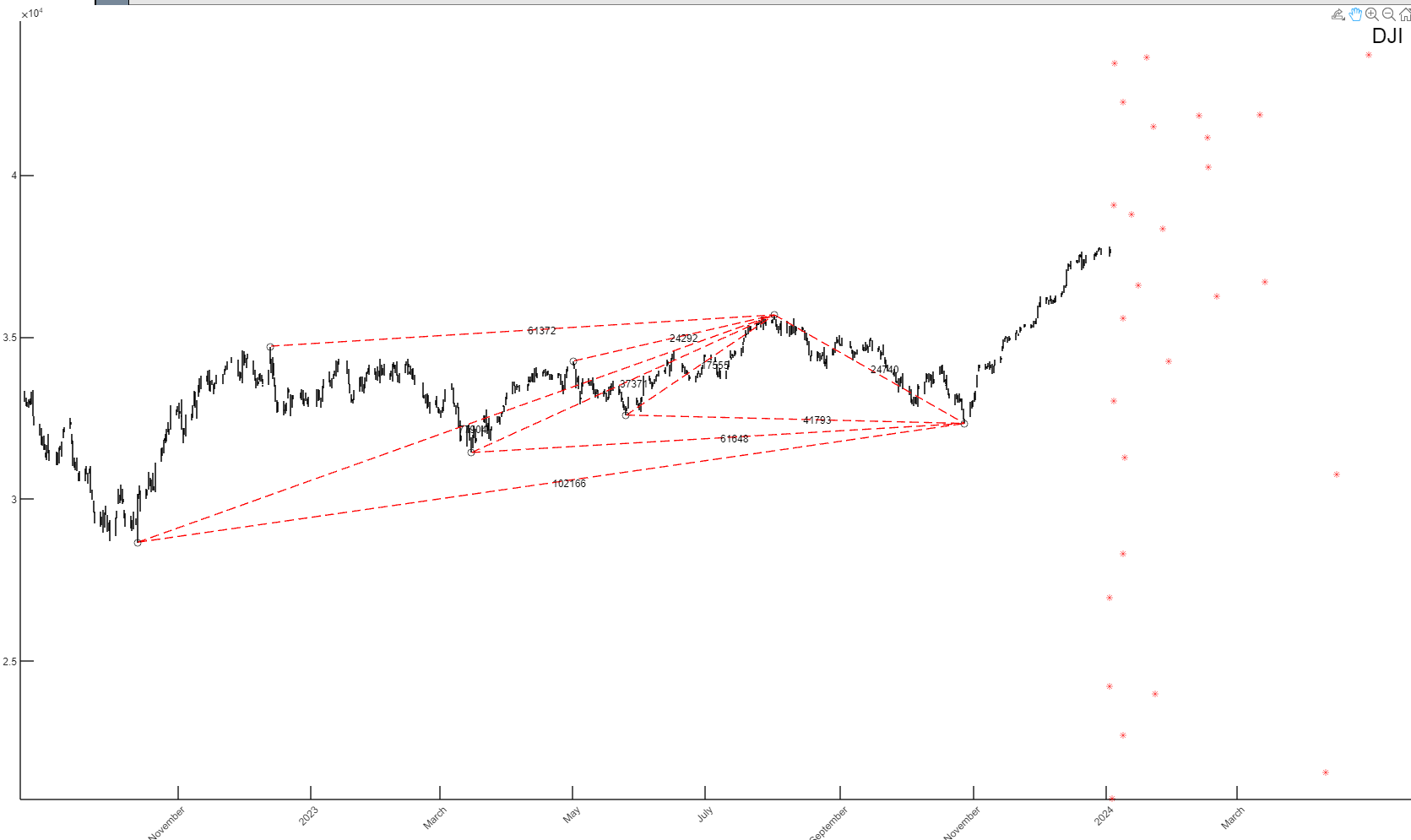
As you know, we run a complex set of multi-dimensional calculations in order to identify upcoming turning points in the market.
For instance, the chart above takes prior mid-term moves, calculates them and then projects upcoming turning point into the future. Represented by the red dots above. The trick is to know which one is the actual turning point.
That is done by converging various TIME turning points with geometric composition of the market. That gives us the final answer.
So, which dot above is the final top – if any?
If you would like to find out, please Click Here