
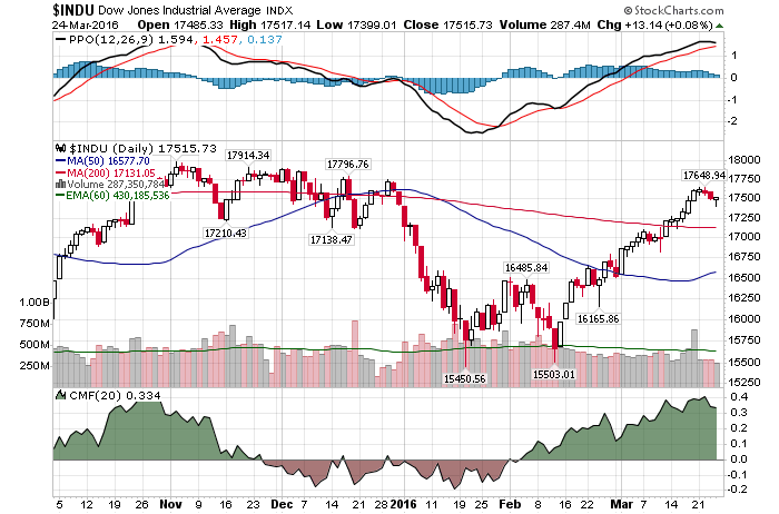
3/24/2016 – A positive day with the Dow Jones up 13 points (+0.08%) and the Nasdaq up 5 points (+0.10%).
As we push into the long weekend, the market is as complex as ever. From a bearish standpoint the market is extremely overbought, at least short-term. Plus, the rally off of January/February bottom has most of the trademarks of a bear market rally.
On the flip side, bulls have quite a few things going in their favor. For one, overall investor sentiment remains bearish. Open any financial media terminal and you will find it full of “Bear Market” or “Market Crash” articles. Further, no one seems to believe this rally, with quite a few big investment banks recently coming out with an actual sell recommendation.
Can it be that easy?
Let’s skip the philosophical discussion and go straight to some important charts.
Chart #1: Hey everyone, look at all of those gaps. If you think the market won’t come back to close them, sooner or later, you are living in a fantasy land.
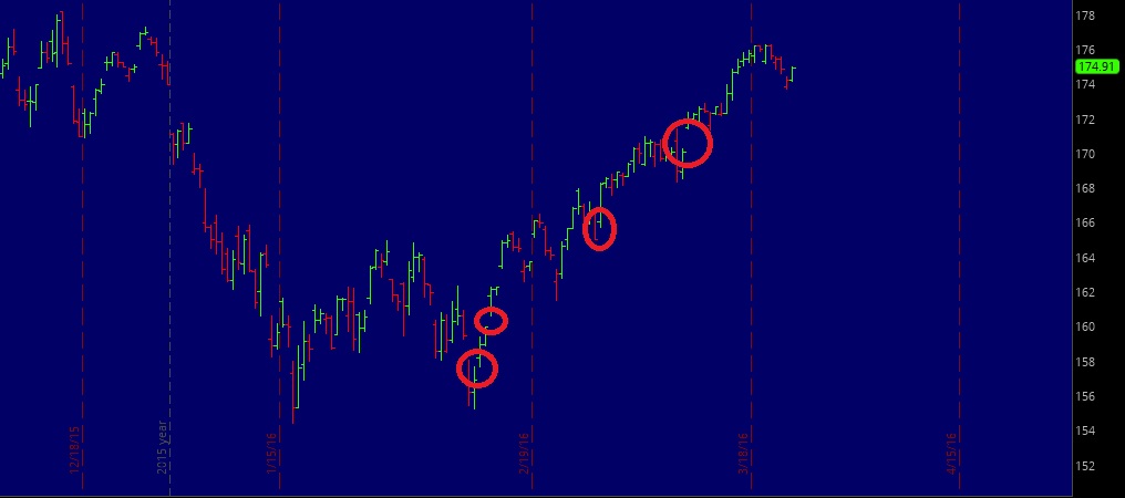
Chart #2: Oldie but goodie. Again, overall earnings/economy are slowing down while Shiller’s adjusted S&P ratio is at its 3rd highest level in history. And on par with 2007. Investors have paid more for stocks on two other occasions. In 1929 and 2000. But, unlike yours truly, most bulls don’t mind paying the same premium today.
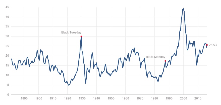
Chart #3: NYSE (largest index by capitalization) is in a clear bear market. Despite the recent rally.
Chart #4: The USD is refusing to sell-off. Despite the FED’s super duper “Dovish Tone”.
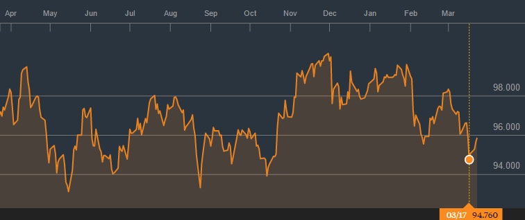
Chart #5: Oh, in case you forgot, inflation adjusted S&P hasn’t gone anywhere in 16 years.
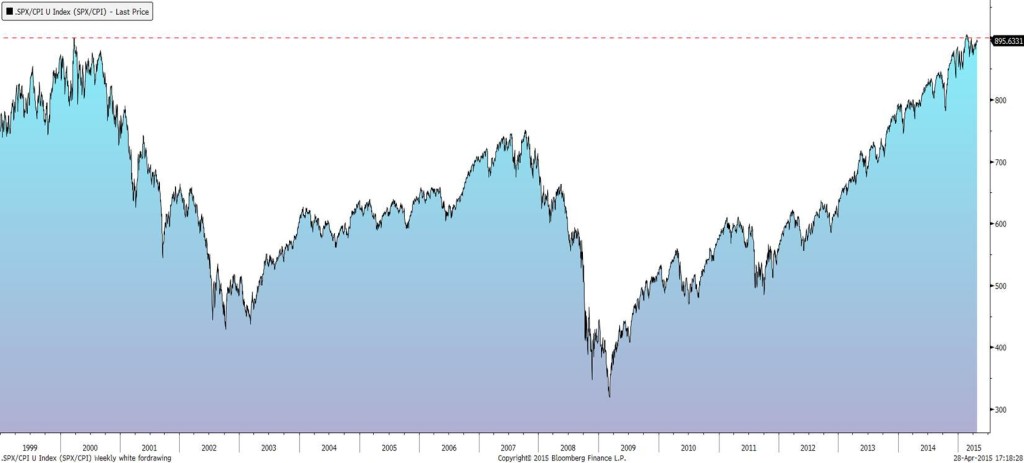
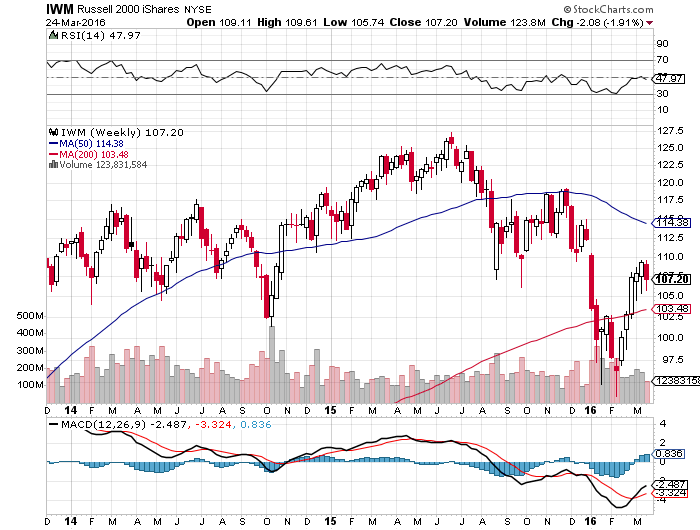
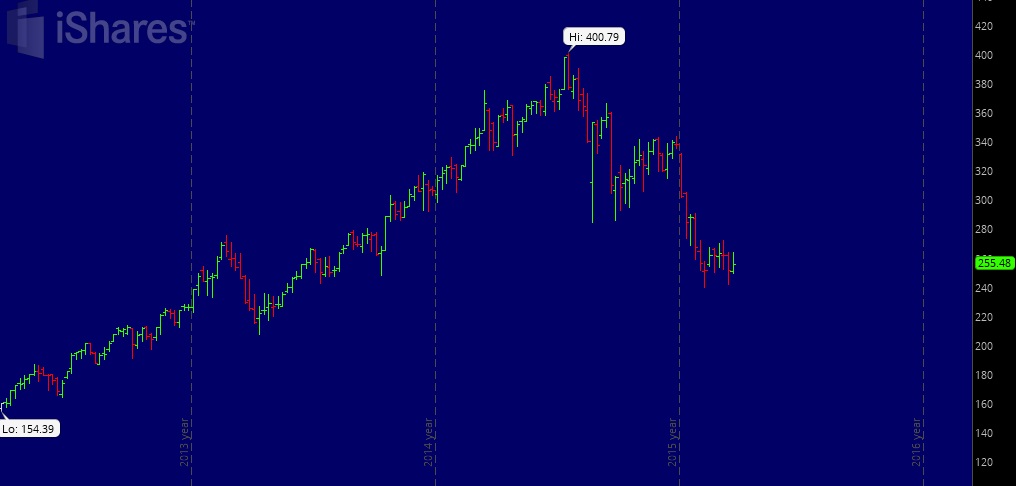
Chart #6: Risk assets that would typically lead a bull market rally are not confirming. Just take a look at this Russell 2000 chart. Plus, the previous market leader Biotech (IBB) is refusing to cooperate as well. These are just a few. There are many other. New Bull market??? Yeah, sure…..to infinity and beyond.
This conclusion is further supported by my mathematical and timing work. It clearly shows a severe bear market between 2015-2017. In fact, when it starts it will very quickly retrace most of the gains accrued over the last few years. If you would be interested in learning when the bear market of 2015-2017 will start (to the day) and its internal composition, please CLICK HERE.
(***Please Note: A bear market might have started already, I am simply not disclosing this information. Due to my obligations to my Subscribers I am unable to provide you with more exact forecasts. In fact, I am being “Wishy Washy” at best with my FREE daily updates here. If you would be interested in exact forecasts, dates, times and precise daily coverage, please Click Here). Daily Stock Market Update. March 23rd, 2016 InvestWithAlex.com
Did you enjoy this article? If so, please share our blog with your friends as we try to get traction. Gratitude!!!

One Reply to “These Shocking Charts Lead To Bullish Nightmares. At Least They Should.”
Comments are closed.